Digital Imaging | Cultural Heritage | Burial Monuments
About Anth 485 Blog
In this Blog you will find work completed for Anthropology 485, Digital Archaeology: Virtual Heritage and Practice in the 21st Century, taught by Dr. Katherine Cook in September of 2017.
The work found here will take the form of blog posts and personal reflections on materials covered in class and assigned readings. All opinions are my own.
Self reflection is good for the soul. Or so they tell me...
Those who know me know that I do not do well with change, but here we are! A brand-new website! This term I am taking a digital archaeology course – right up my alley. The first project was to learn how to use HTML and CSS, and create a website. The perfect opportunity for me to upgrade and prettify my digital portfolio, and generally make my research look and feel more accessible.
Now, the process of learning HTML and CSS has been quite rewarding! Like math, there is a right answer and a wrong answer. Unlike math, I am not terrible at it! My goals in rebuilding where I publicize my work was to make it look nicer, feel more relatable, and hopefully be more accessible to myself and anyone interested in what I spend the majority of my time sleeping, eating and breathing.
Then came the fun part. Solving the problems that cropped up around the way! I will admit, I was lucky enough to not have to code the entire website from scratch. By using a template, I have saved myself (and everyone else in my life – hi guys!) a lot of pain and infuriation. That being said, I have been having an interesting time trying to get my images to display in the fashion that I desire. I do not yet have a good enough grasp on manipulating previously created code to bend it to my will, so while this website is still under development, landscape images for all! The fix for this is simply gaining more experience working with code.
Overall, I am quite pleased with how things have turned out so far. I have enjoyed getting to learn new skills, and put them into practice. Working on projects like this is something I enjoy doing. The trial and error aspect means I can learn from my own mistakes, and create a final product that I am proud of. This is very much a work in progress, as I intend on expanding the data I am presenting, and continuing to add previously collected research. Additionally, I intend on learning how to work with the code enough to solve my frustrations with the image carousels and one day soon add some images that are portrait orientation, rather than just landscape orientation!
DISCLAIMER: There is currently a glitch with the image carousels that I am working to remedy. More images will be added as possible, and the scroll buttons will one day work! Thank you for bearing with me during this transition period!
So I've been playing with making data interactive...Part 1
The topic of discussion this week was how we as anthropologists can make our data interactive. I have been working with this same data set for several years now, and have become very comfortable with it. The intereactive set of words seen below comes directly from my data set of all the individuals listed in the Emanu-el Cemetery, along with dates, where they came from, inscriptions on their burial monuments, along with other information that has been documented. Looking at the data from this perspevtive has provided me with a far faster, simple way of analyzing the text. WHen hovering over a word, all other words related to that particular word gets highlighted, and the program provides a number, relating to how many times that word has been used in conjunction with your chosen word of interest.
For people who don't have time, or are not interested in sifting through an entire data set to pull these relations out, this is an excellent resourse. I chose this over a word map, because it provides more information about the linguistic aspect of the cemetery, and it felt more interactive and personal to me, rather than simply looking at a pile of words that, while they make a statement, they don't necessarily add to what we know about this data set.
A little Halloween fun
For kicks and giggles, and as part of procrastastudying (definition: procrastinating from studying for one class by studying for another. I just made that up, enjoy it!), I have created a fun little chart made with Pictochart.
Very simply, it is meant to be a fun look at several burial options through out history. All made in fun, not to be taken seriously! However, I have now discovered Pictochart! Part of the point of the exercise is to put it into practical use, and to see how it could be relevant to digital archaeology. This is a great tool that can be used to make charts, presentations, and pamphlets. It is easily customizable, and has loads of different options for figures, inserting charts of all kinds, and can be used digitally or in print. Plus, then you can make fun and silly little charts like this to distribute to your friends (which I will absolutley be doing)!
So I've been playing with making data interactive...Part 2
The project assgned for this component of looking at digitla archaeology included an option to submit our projects to The Heritage Jam. I will be submitting this project as an unfinished template, showing what can be done with this dataset. My proposal will be based on including a variety of information, such as environmental changes over time, social and political events, and major events within the community. This timeline could also be expanded or altered to include only pioneer burials in Victoria, or limit the data to certain time periods.
My focus with this class has been on how I can manipulate and display the dataset I have been working with for seeral years in different ways. I have selected a number of individuals from the cemetery, with dates ranging from the first internment in 1861, to 1889. Out of respect to the community, I have left out any modern data, however all of that data could be easily added to create a complete timeline of the usage of the cemetery.
I feel that this is a great tool for this project. This data has been collected for the community, and having an easily accessible resource, such as a timeline, makes all of the information we have collected easy for interaction, and it allows us as anthropologists to visualize the data in a different way than pouring ove Excel tables.
I chose to create my project through TimelineJS, not only because it creates something accessible to a variety of people, but also because it has value interms of being applicable for all sorts of different projects. For this project in particular, I can link to data sources outside of my template and website, and I can include images and text, allowing for the interactivity part of the project.
Personally I have found this resource to be an interesting one to work with, I have started thinking about my data differently, and thinking about how I would go about collecting more data in the future. Housing the data in an Excel file was an easy transition for me as that is the medium from which we have been storing and analyzing the data to this point. I did however find the input from one table to another to be timeconsuming, and I would have to develop a more efficient way of data input when adding to this project (or creating a new project) in the future.
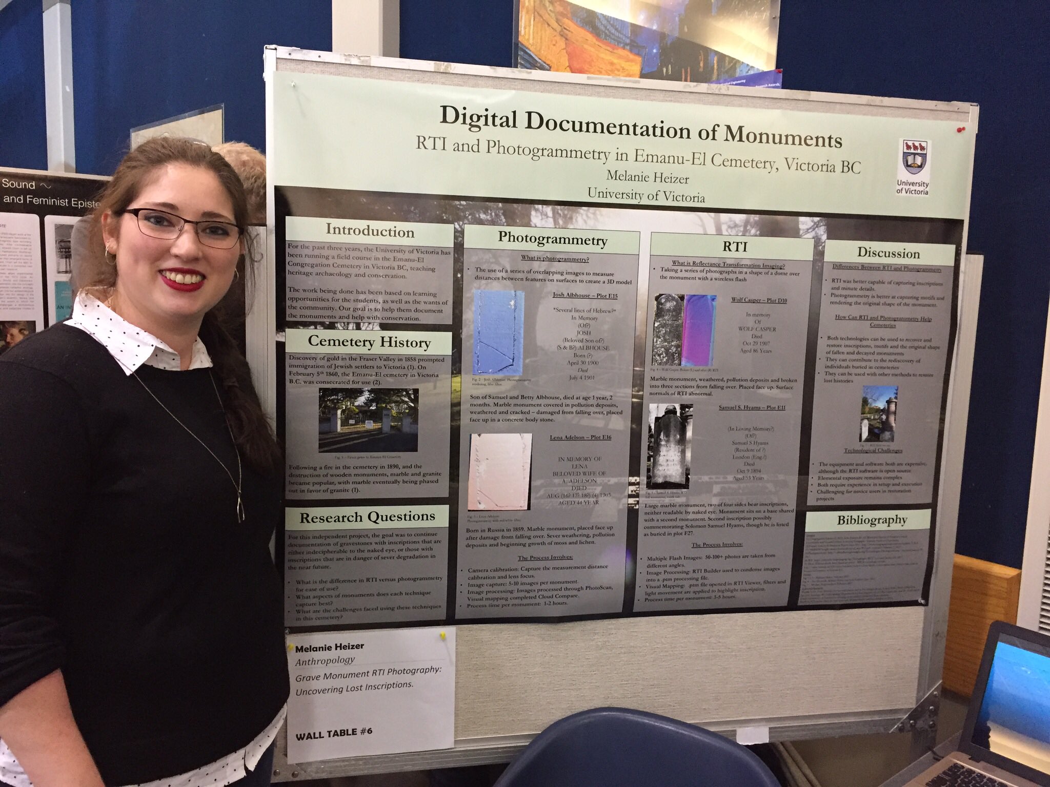
3D Visualization
Working with 3D images is something I have done a fair amount of over the past 3 years. My independent research has been based on creating photogrammetric models of monuments, I have taken part in a course on how to use TinkerCAD are very different animals in the world of digital modeling, they all create 3D models.
This week we used TinkerCAD to play with to create 3D printable objects, like this keychain model. After having used both SketchUp and TinkerCAD, I found that I prefered using SketchUp (see example below), though it was a far more complicated program to learn. The upside to TinkerCAD is that it is very simple to use, and is hosted online, and doesn't require downloading to run and create models with. I found that there were more option for manipulating the objects that we were recreating in SketchUp than I had in TinkerCad. Overall they are both efective programs to use, though I would likely not use TinkerCAD very often, and would opt for SketchUp as a personal preference.
P.S., There happens to be a weird thing happening with the model in this embedded version that wasn't happening previously. (Also available through Thingiverseas a .stl file) To be fixed when the problem is identified!
Success versus functionality: A lesson in humility.
What began as an idea for a fun, simple digital tour with images of artifacts interacting with a modern museum exhibit, turned into what can only be described a good idea gone awry. My goal in this project was to meld images of artifacts from the past with a modern exhibit at the RBCM. By using technology, I had hoped to create a digital treasure hunt where members of the public would be able to walk through the exhibit, discovering digital representations of a selection of the artifacts found at the Historic Songhees Village/Shutters site, the Johnson Street Bridge Site, and the Department of National Defense dredging sites in the Esquimalt Harbour. This project was built using Aurasma, a platform meant for digitally layering images on top of other images, augmenting reality, and creating an interactive opportunity for museum visitors. Finally, I wanted to put my digital skill to the test, and create something different from what I have been working on for most of the semester.
With some planning, I decided to choose a selection of images that would best represent the individual sites, and that would be best tie the permanent exhibits at the RBCM and to the pop-up exhibit sites and artifacts. This selection process meant looking through the images taken at the archives, and those found in the documentation of the Esquimalt Harbor dredging projects. With the images selected (five images from the Historic Songhees Village/Shutters site, five images from the Johnson Street Bridge Site, and two images from the Esquimalt Harbor dredging project), I then realized that I would need to use Photoshop to edit the images into the format that I wanted them in. Originally, I had planned to have the artifacts standing out in the pictures by having the backgrounds made opaque. This was my first major struggle. My Photoshop skill were found to be lacking, and I did not have enough time to adequately develop these skills within the project’s timeframe.
The next step of the project included creating trigger images to be used by Aurasma to prompt the displaying of the artifacts. I originally chose to use the same symbol that was on the promotional material for the exhibit; however when I placed them in the museum for the image capture portion of their creation, the lighting in the museum hampered their effectiveness, as Aurasma was very picky with the types of images and the image qualities used. I redid this part of the project a total of three times, each attempt with different trigger images, attempting to find an adequate image with a balance of color, lighting, image ‘busyness’, and distribution of figures within the pictures.
The simplest part of the project was creating the Auras in Aurasma. The process of uploading images, and layering them on top of each other was only a handful of steps each, and took approximately 25 minutes to create 12 Auras. Had this process taken longer, I would not have been able to test out several different approaches to triggering the artifacts.
Overall, I stand by the idea behind the project. While my attempt was not a success this time round, I do not see it as having been a failure of a project. I would have preferred that it worked flawlessly on exhibit day; however, I think that I have learnt a lot about the process of digital heritage project development. To me, seeing how the use of Aurasma in a museum setting like the RBCM would and could be used effectively constitutes an overall success.
Twinery: A Digital Walkthrough!?
Ok team! Today I made a thing, I like the thing and I think it might actually work (unlike last thing, see above post)!
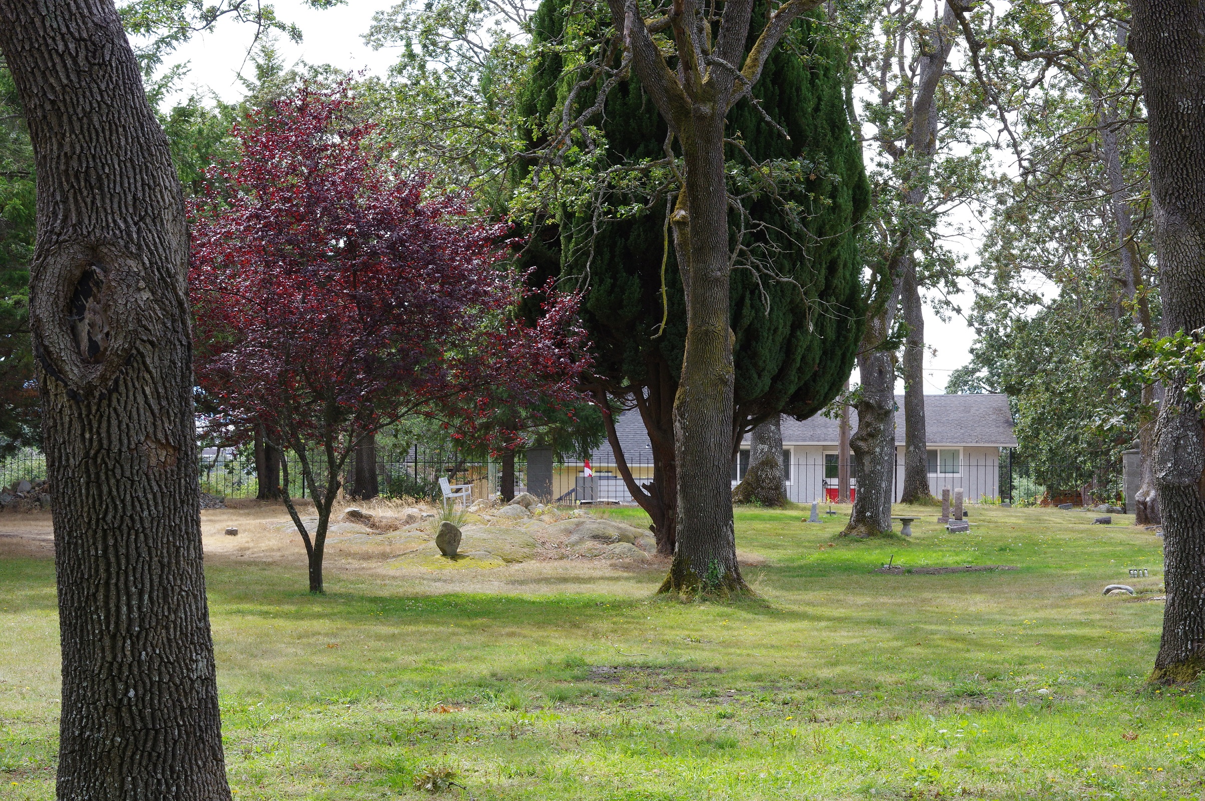
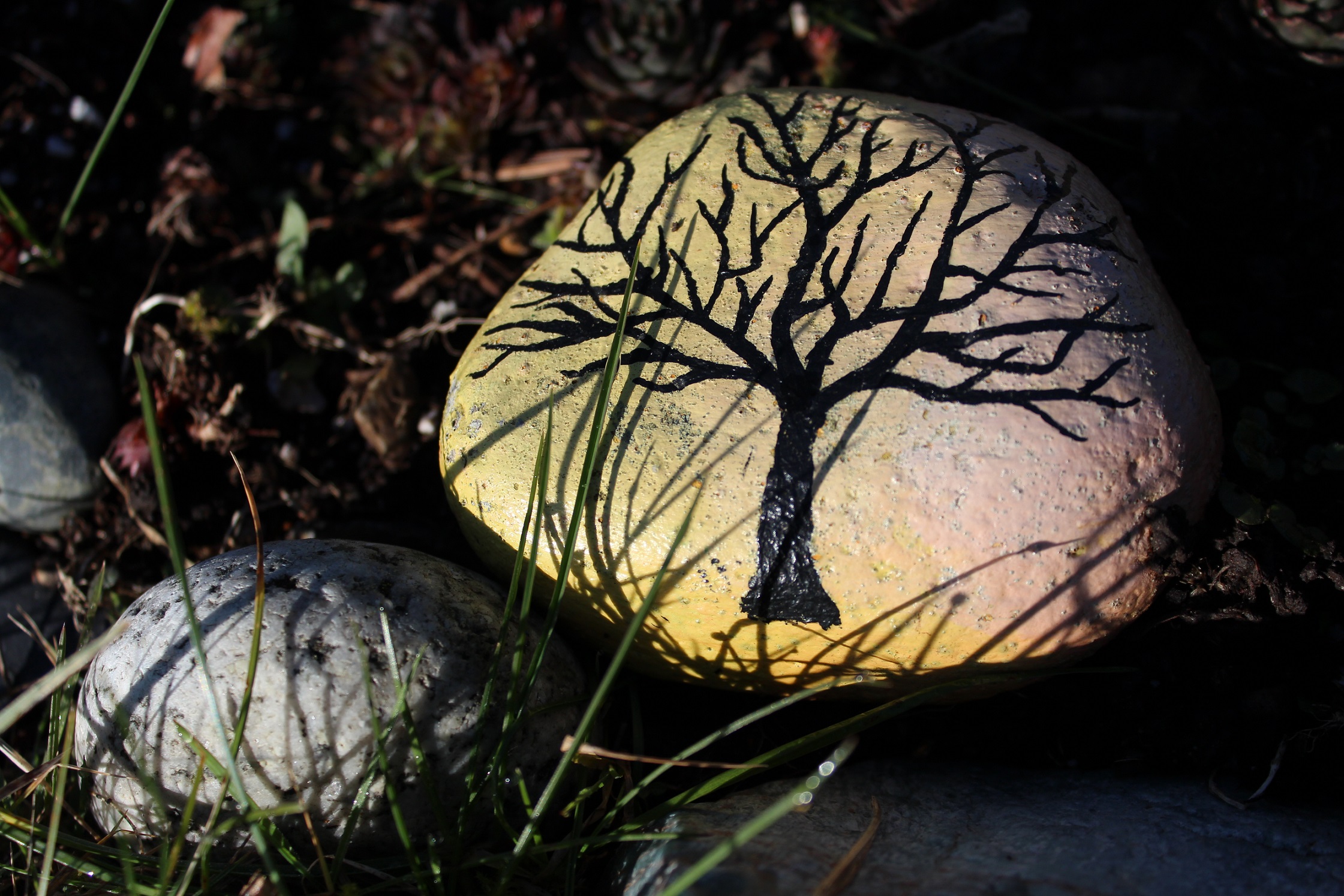
I present to you here what will be my last portfolio project for this course. As the topic for the final portion of the class was augmented reality, I have attempted to make a virtual walkthrough of the Emanu-El cemetery. I used a program called Twinery, that has both a downloadable workspace, and an online workspace.
I spent a lot of time reading the guides about how to use twinery, and I have concluded that what I have created is really a very simple version, and I have not touched on even a quarter of what this software is capable of doing. My goal was to allow people to step away from the 'death' aspect of what my projects have been about (and what the majority of my research is), and create a relaxing space with images and the lovely sounds of being outside on a fall day. I am pleased with how it has turned out so far, though I have a little tweaking to do prior to handing the final version in!
In the mean time, here is what I have created so far. Keep in mind that it may change a bit over the next few days!
UPDATE: The necessary changes have been made, and the final project has been handed in! Thanks for coming along for the ride! While this course is now finished, I will be continuing on with my research.
Liminal Spaces
Coming Soon
How do we see cemeteries in daily life? Are they a space for happiness, or only for sadness?